Medical Trainer
Project Overview
What is PennVR Medical Trainer?
PennVR Medical Trainer is an all-in-one virtual reality training simulator that's flexible and distributable. It seeks to help current and upcoming medical professionals on scenario training, patient assessment, and decision-making.
It is a Quest 2+ native application that aims to be widely distributed and accessible to any medical professionals while maintaining a high level of realism and medical accuracy.
Goal
Penn VR Medical Trainer has been in the early stages of functionality development for the past year. With a lot of the functionality built out, the project is stepping into beta for testing and needs a refresher on its UI. I was tasked with the redesign of the UI.
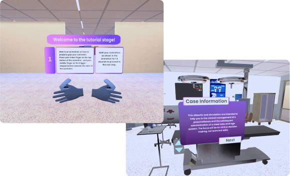
Original Design of PennVR
My Responsibility
Research
In order to gain a deeper understanding of the targeted users, I gathered feedback from 29 participants that are currently pursuing doctoral degree. The survey focused on investigating the current user satisfactions, discovering the difficulties and frustrations that the students and the faculties encountered during the processes.
In addition, I also interviewed 4 faculties to gain a deeper understanding from the perspective of medical professionals, especially focused on how they approach the training of students, and designing scenarios for training and examinations.
The results of the survey uncovered some findings that was rather unexpected.
Challenges
Initial Challenge - The New Medium
Penn VR Medical Trainer is a virtual reality application, a format that is yet widely adopted by the main-stream. During the testing session, I discovered that over 79% of the participants have never put on a head set before and only one participant claimed to be an active user of VR. The unfamiliarity with this new technology significantly decreased the user experience for many participants. I observed that many tries to navigate the UI while learning the novel interaction method, getting frustrated when they were unable to locate the correct button. It also hindered the participants’ ability to effectively learn from the material, as many reflected that they only remembered the later parts of the materials.
-
No VR Experience
79%
-
Had VR Experience
17%
-
Active VR User
4%
Unique Characteristic of Medical Students
When the simulation was designed, the training material was created based on the assumption of the designers and testing results gathered from first year student. During the testing, I noticed a common habit found on many participants, which is med students tends to have much lower desire to explore the environment and just try things out. Instead, they tend to follow strict to the instructions given during the training module. This characteristic had a significant impact on how I approached designing the training module later on, and prompted us to create more detailed and diegetic instruction within the scene.
User Persona
With the data I collected, and combined with the stakeholder's vision of the product, I created two user personas that represents our two main target audience groups - students and instructors.
User Flow
During the testing session, I observed that many participants were confused by the complex interface in the original design. This not only frustrated the users, but also my colleagues and I, as we cannot easily guide the user without seeing what the user is sees. As a result, the users often mis-interpreted our instructions when we were helping them, making the training session less effective.
To mitigate potential user confusion arising from a complex interface, the user flow was designed to be streamlined and intuitive. This approach give user direct access to the core activities to minimize the need for external assistance, and when the need arises, allows the instructors to give clear and simple instructions that will not be easily mis-interpreted.
We also sketched up some ideas for tutorials in order to help the student get familiar with the control and to encourage them to explore the environment more.
We listed out all the functionality that was in the previous version, reorganized and cleaned up the user flow.
Design
Wireframe
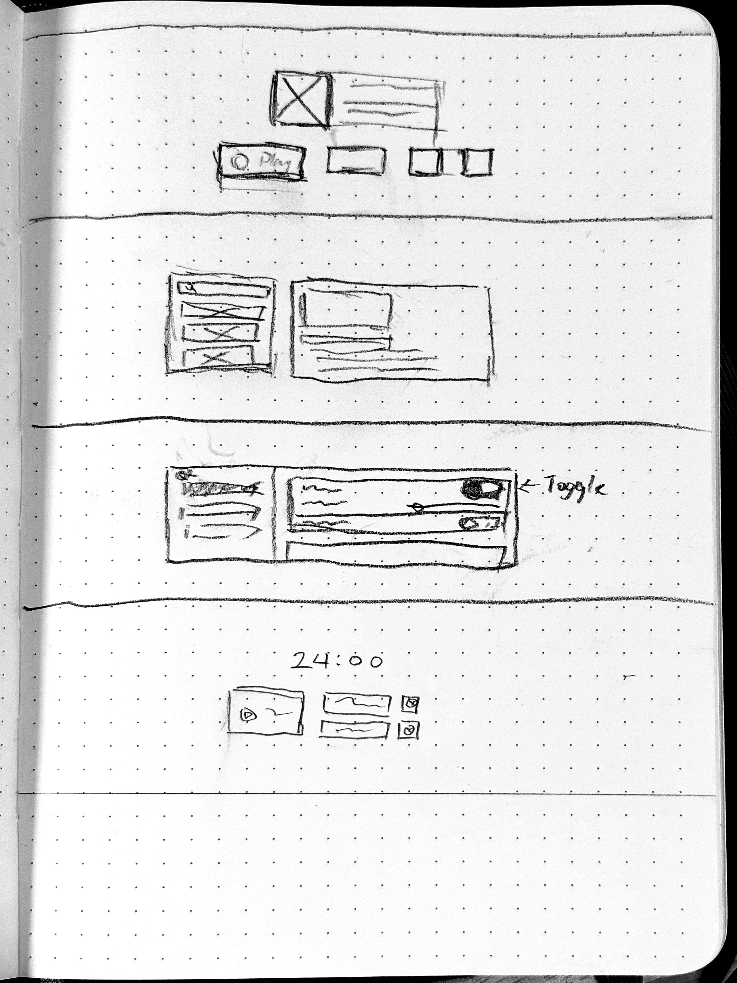
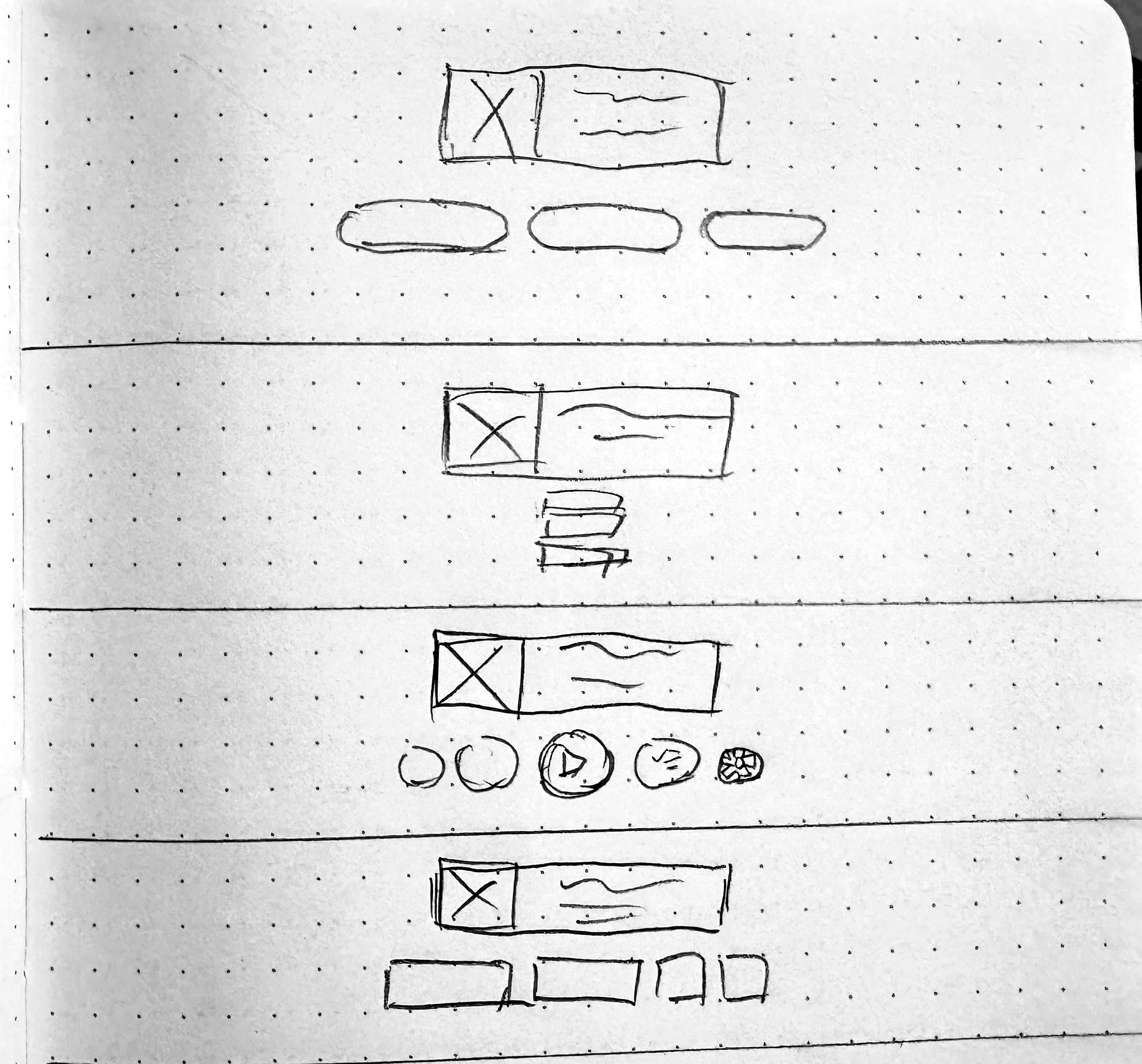
Each member sketched out some wireframe to kick start the design, we emphasized on home screen as it will be the first impression for our users. The pictures were the top candidates out of the selections.
We ultimately went forward with the grid design after getting some user feedback on all the variants, the results aligned with the team's opinion as we all agreed that it's the most flexible and cleanest looking one.
Styling
After doing research on other medical related application, I choose blue as the primary color of the style as it's commonly used in the medical field.
The core principle of this design is simple, to make UI elements exist in the 3D space as it is a real object. To create the sense of depth within the UI elements, I drew inspiration from the neumorphism design and glassmorphism design.
For panels and buttons, I used techniques found in glassmorphism design, where the at the top there is a rim of highlight mimicking the fresnel effect, to make the panel sit as a sheet of frosted glass. For the smaller elements, instead of using neumorphism throughout the whole screen, I applied it on icons and widgets within interactable elements in moderation to create the illusion of elements being embossed/debossed.
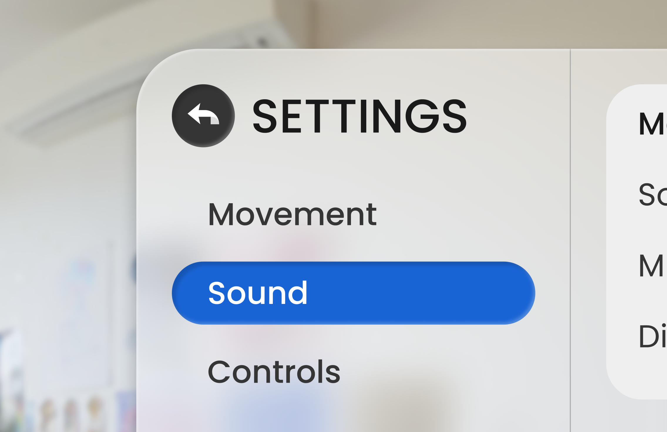
Close up of of panels and neumorphism elements
Style Sheet
Results
Main Menu

Scenario Selection

Settings Menu

Pause Menu

Confirmation

