CLINK
The better drinking experience
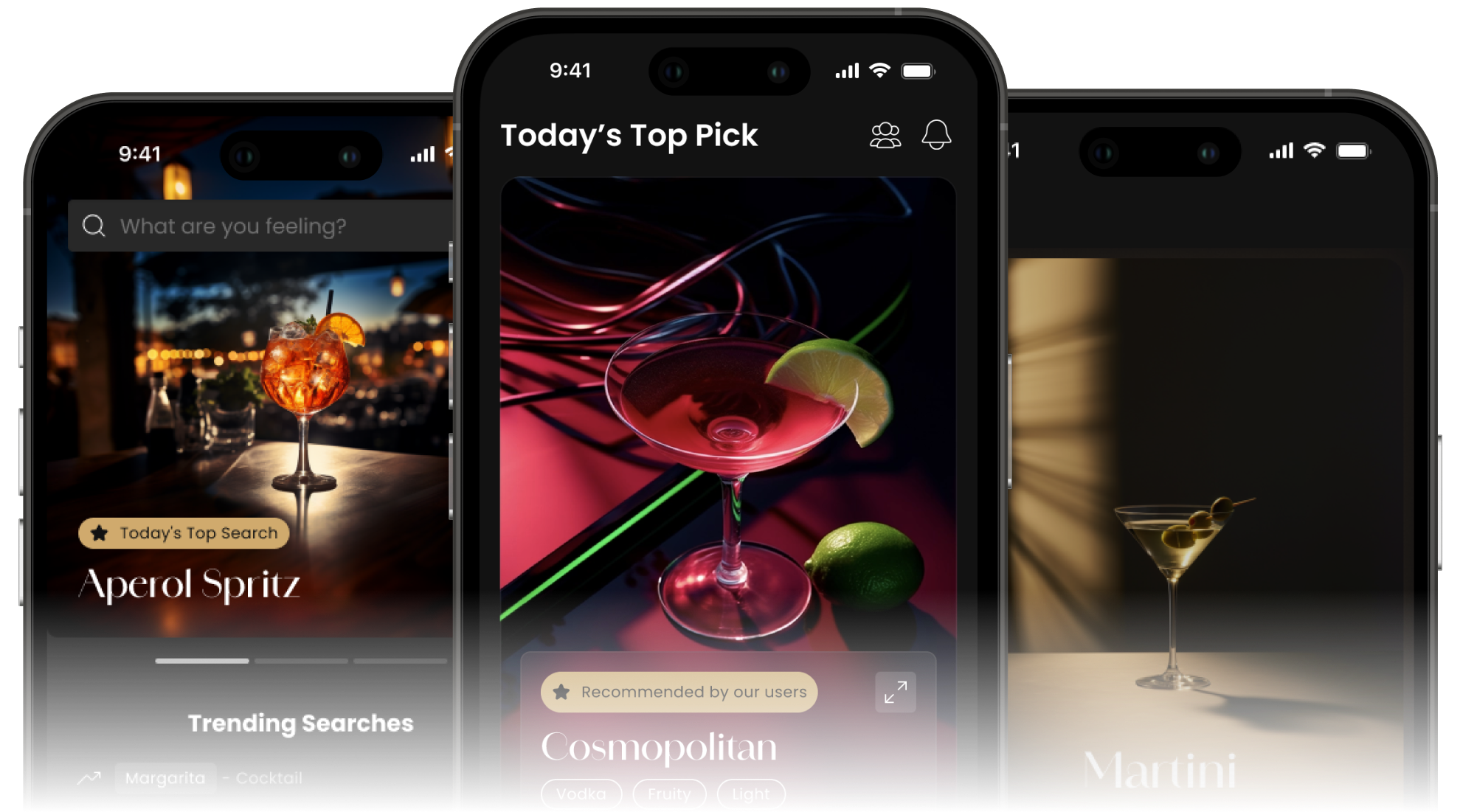
Branding | UX Research | UI Design
Tools
Duration
September 2023 - June 2024
(9 months)
My Role
Lead UX Researcher
- Validated and refined product ideas and problem statements
- Planned, created, and conducted surveys and user interviews
- Performed usability testing, collected, and analyzed data
UX Designer
- Identified user needs and pain points
- Designed user flows, wireframes, and prototypes
UI Designer
- Create interactive prototypes
- Collaborated on the design system
After Countless
Glasses of
Vodka-Cran...
When I first turned 21, I had my first drink from the bar. I asked the bartender for
recommendation, it was a Vodka-Cran. Second time, they recommended the same thing. Because
of schools and life, like many, I didn’t it had much time nor made too much effort on
researching new cocktail each time I go out. Vodka-Cran became my “usual”, not by choice.
Sharing the same frustration with many others, out team set out to create Clink.
Through user-centered design process, we validated our assumption about user needs, and crafted an experience that’s personal to each user.
Clink aims to help new and inexperienced drinkers to explore the variety of drinks, develop personal tastes, and build their knowledge so they can enjoy their drink options with confidence.
The Problem
New drinkers often struggle with ordering due to unfamiliarity with drink names, ingredients, and high costs. This uncertainty creates anxiety, making the experience overwhelming and discouraging exploration.
The Approach
Research & Verify
- Verify core assumptions
- Identify user needs and pain points
- Pin point target audience
Define
- Research & identify features
- Create site map & user-flow
Design
- Wireframe & prototypes
- Design system
- Branding
Iterate
- Usability testing
- Feedback analysis
Research & Verify
To kickstart the project, I lead the team and conducted a rigorous six-week study
incorporating research, surveys, and interviews to ensure our approach was informed by
real-world insights, laying a solid foundation for the design and development.
While our team had firsthand experience with the challenges of ordering drinks at bars, to ensure
these struggles were widely shared. I set our first goal to validate our assumptions.
Social Media Research
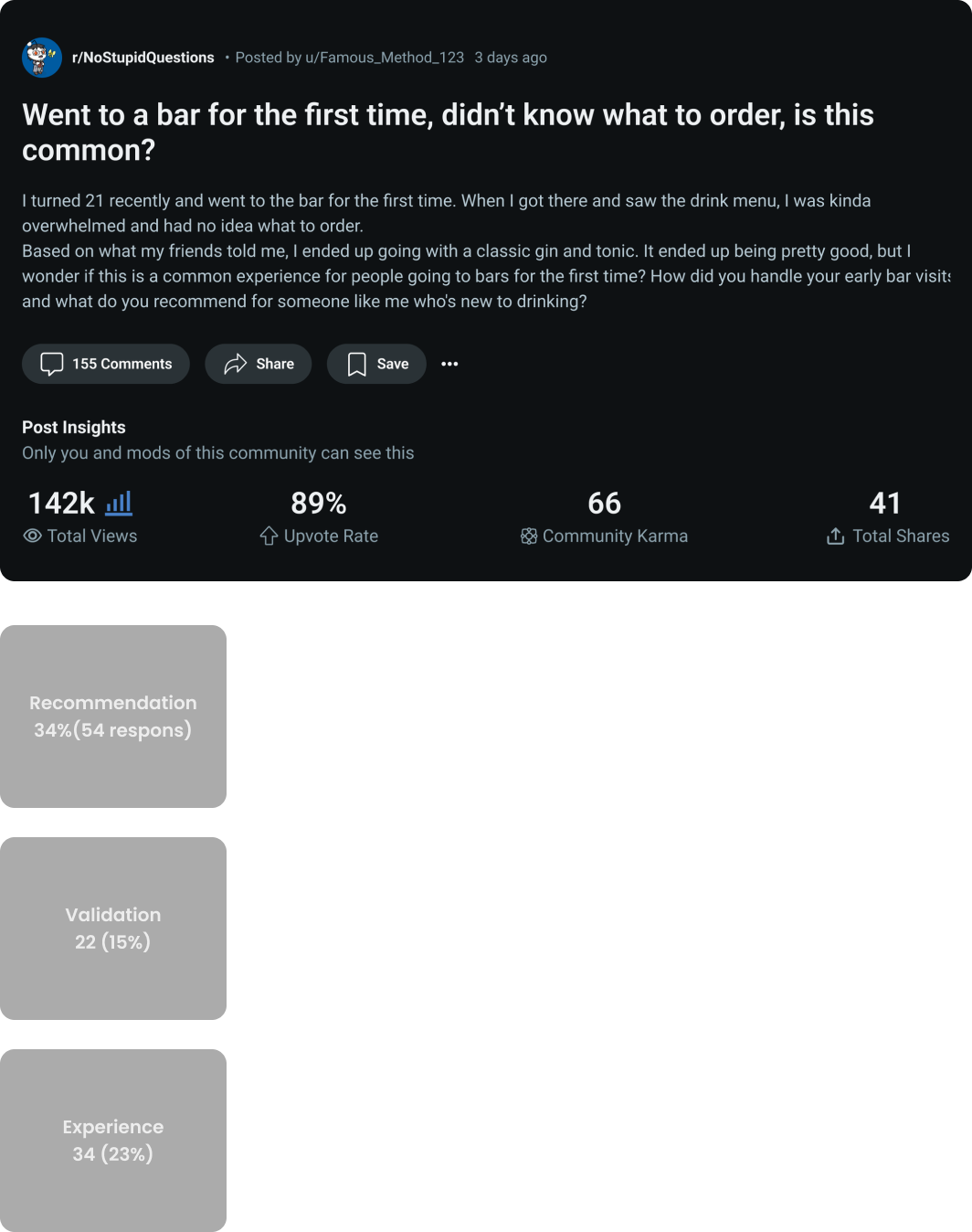
To gather anonymous and authentic user insights, I leveraged Reddit as our primary research platform. Engaging with relevant communities, we wanted to know whether our challenges in ordering drinks were commonly shared.
Our findings confirmed that many individuals face similar frustrations. The decision-making process can be overwhelming, and the anxiety of navigating drink options at a bar is more prevalent than we initially anticipated.
Survey
To add on top of our social media research, I also sent out survey to help us get a better understanding of the issue. We gathered around 100 responses with results that are aligned with our assumptions.
96.7%
of the people sometimes, often, or always order alcoholic drinks at restaurants or bars
73.6%
of the people who responded 1-3 in confidence (low) of ordering a new drink and liking it are in the 21-23 age range
69.7%
People who are in the 21-23 age has the most tendency to sometimes, often, or always research research before ordering something new.
82.6%
of the people responded 3-5 (high) in being interested to learn more about drinks.
User Interviews
After validating our assumptions, I aimed to gain a deeper understanding of user
experiences, needs, and pain points. I curated and strategically organized a set of
questions into a structured flow to ensure a comprehensive exploration of user challenges.
We recruited 10 participants with varying drinking experience, along with bartenders, to gain
insights from both sides of the counter.
This helped us distinguish common pain points among all drinkers, challenges that
diminish with experience, and issues specific to new drinkers.

Takeaways
Influences
What do people consider when choosing a drink?
Word-of-Mouth - Most people rely on recommendations from family, friends, or bartenders to discover drinks.
Ingredients - Experienced drinkers can anticipate a drink’s flavor based on its ingredients.
Tastes Preference - Drink choices are largely driven by personal preference, with most individuals rarely venturing outside their comfort zone.
Pressure & Struggles
What’s the cause for new drinkers to feel anxious and unadventurous?
Unfamiliarity with drink names - Bars often use unique names or variations of common drinks, making selection confusing.
Unfamiliarity with ingredients - New drinkers lack knowledge of how ingredients influence flavor.
Expensive - The expensive price of cocktails in bars and restaurants makes exploration costly.
High chance of disliking - Research indicates a high likelihood of dissatisfaction when trying new drinks.
Interactions with Bartenders - Many participants prefer to avoid engaging with bartenders, especially when they are busy, and feel pressured when making a selection.
Defining Clink
Our research provided in-depth insights into our target users and their challenges. We identified our targeted users are new drinkers from age 21 to 28 that are interested in learning more about cocktails. To better understand their needs, we developed two user personas and journey maps representing different personality types, both of whom could benefit from Clink:
Emily – An introverted user who prefers minimal interaction with bartenders, using Clink to navigate drink options independently.
Emilio – An extroverted user who understands that busy bartenders often recommend drinks that are easier to make. He uses Clink to explore and select a drink that suits his preferences.
User Persona & Journey Mapping
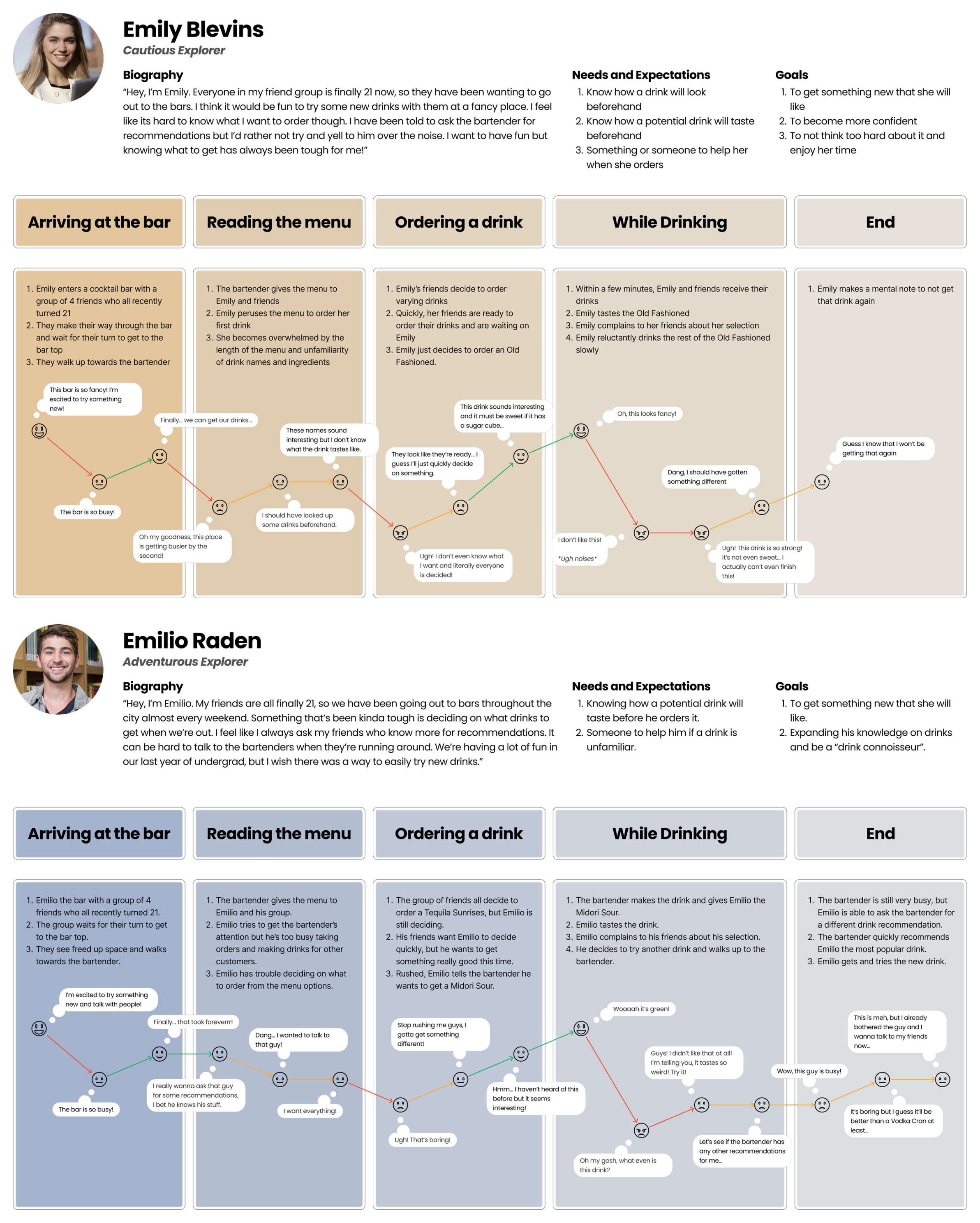
Through both personas and journey maps, I discovered some common pain points and opportunities.
Opportunities
Pre-Bar Drink Exploration
Allow users to explore drink options with visual and key details like taste profile, ingredients before arriving at the bar
Personalized Recommendations
Suggests drinks based on the user’s taste profile, enabling exploration with minimal risk of dissatisfaction.
Drink History Recall
Enables users to track and reference past drinks, helping them make informed future choices based on their preferences.
Ingredient-Based Search
Allows users to discover cocktails based on preferred ingredients, helping them find drinks that match their flavor preferences.
Feature Research
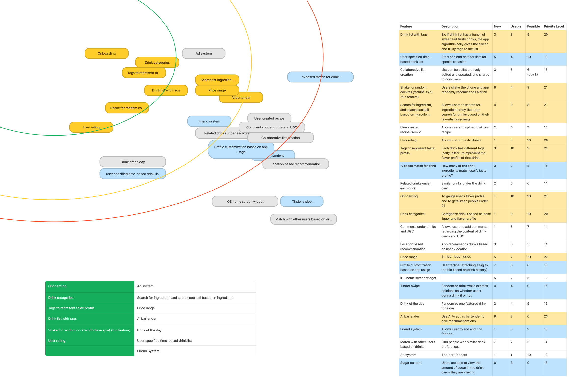
To create a user-centered and well-informed MVP for Clink, I lead an in-depth feature research through competitor analysis, an effort/impact matrix, NUF analysis, and user surveys. These methods helped us assess the feasibility and impact of each features, by combining with our previous research, we narrowed down our selection to 6 key features and that align with both user needs and business goals.
MVP Features
Personalized Recommendations
Ingredient-based search
Onboarding
Taste Profile Tags
Drink Categorization
Create Drink List
Site Map & User Flow
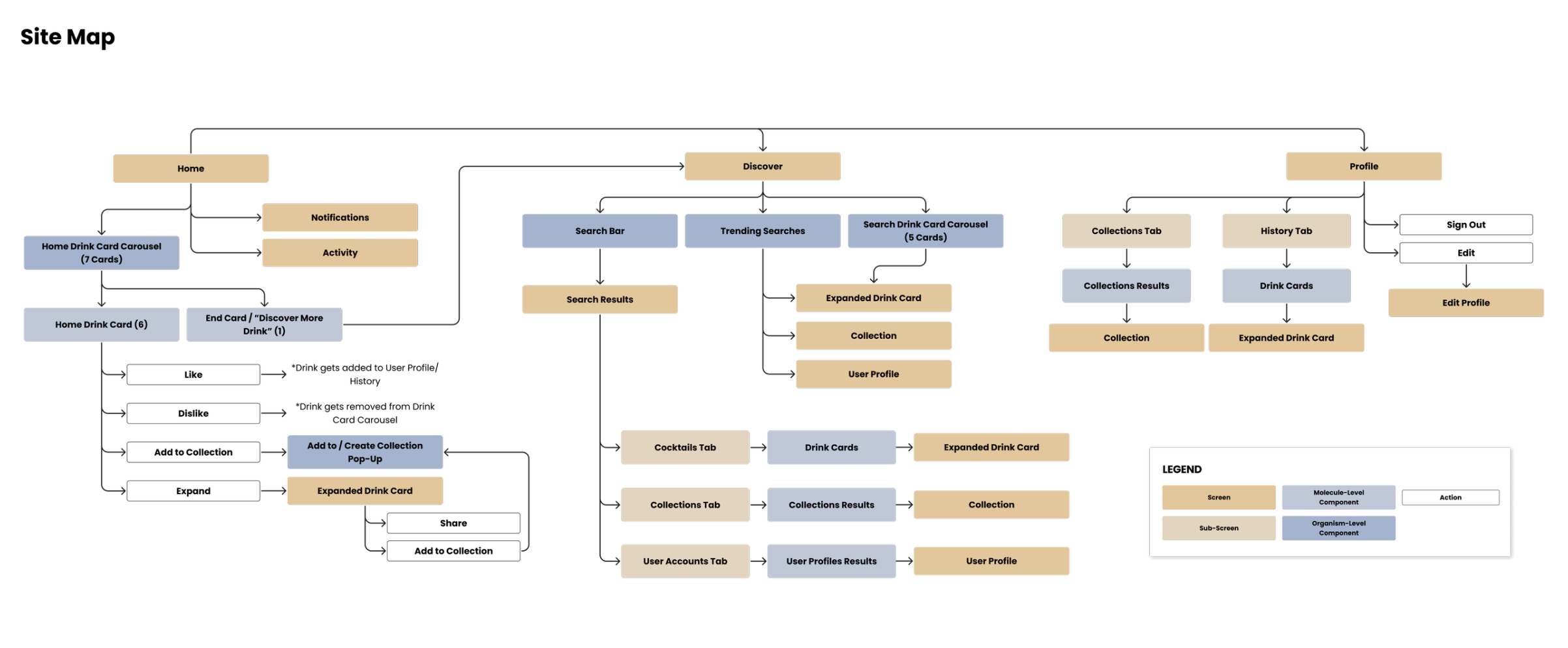
After defining the MVP, I conducted several whiteboarding workshops, including activities like card sorting, to develop the site map and user flow. Establishing this foundation early enabled us to create wireframes for all interactions, allowing for early testing and rapid iteration. This approach ensured the final design aligned with our vision, providing users with a seamless experience.
Design
Wireframe
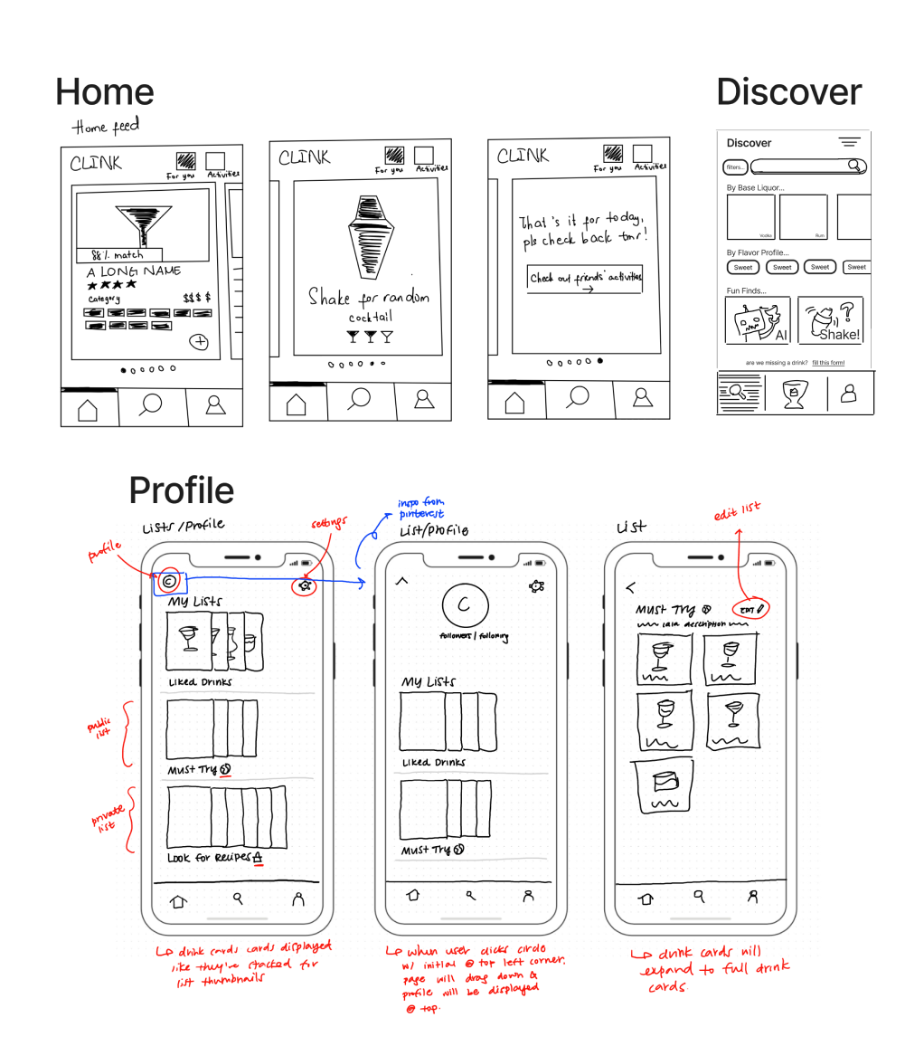
With the foundation in place, our team explored multiple screen variations through collaborative whiteboarding sessions. We conducted user testing, including A/B testing, to validate design decisions and ensure an intuitive user experience. Through iterative refinement, we merged our designs to create the final wireframe.
Branding
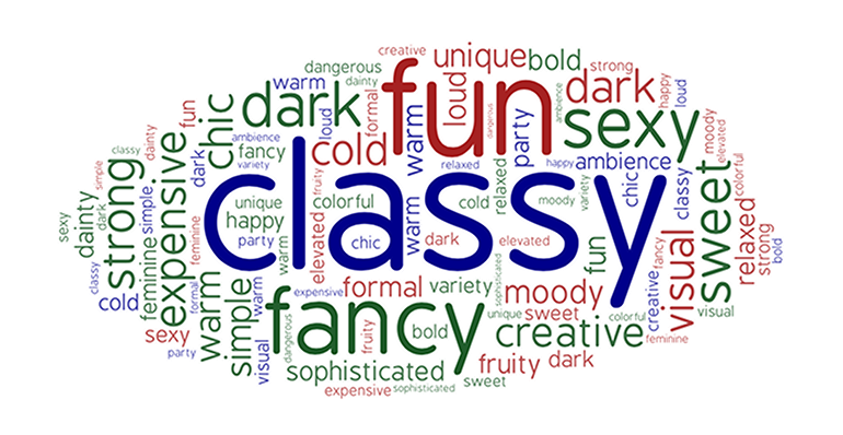
While our team had a vision for Clink, we wanted to understand how users perceived it. We
conducted surveys, gathering words users associated with Clink.
The most common descriptors were
“Classy,” “Fancy,” “Fun,” “Dark,” and “Sexy”. These insights
guided the development of Clink’s key visual identities.
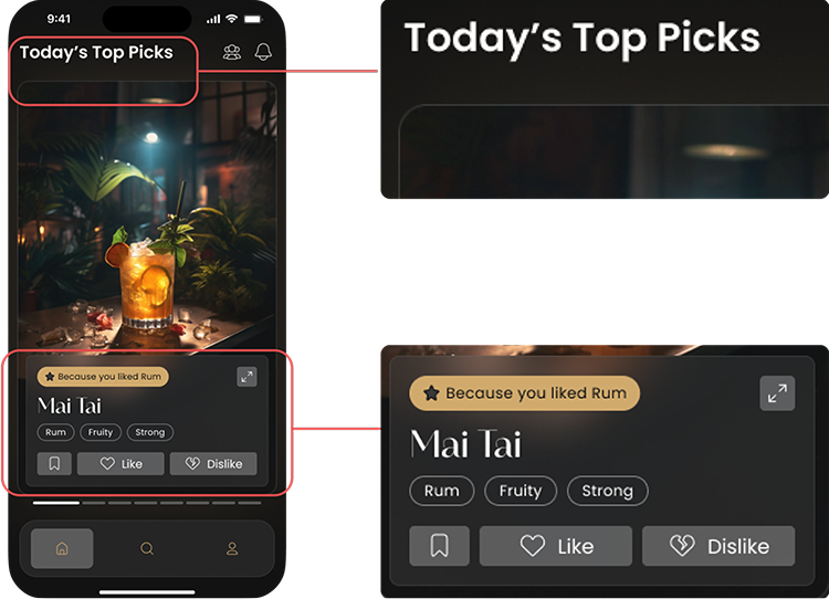
Radiant Glow - Inspired by bar spotlights, this design
element enhances imagery, allowing users to see drinks as they would in a real bar
setting.
Glassmorphism - Enhances elegance and exclusivity while adding
a touch of mystique, elevating the overall user experience.
Design System
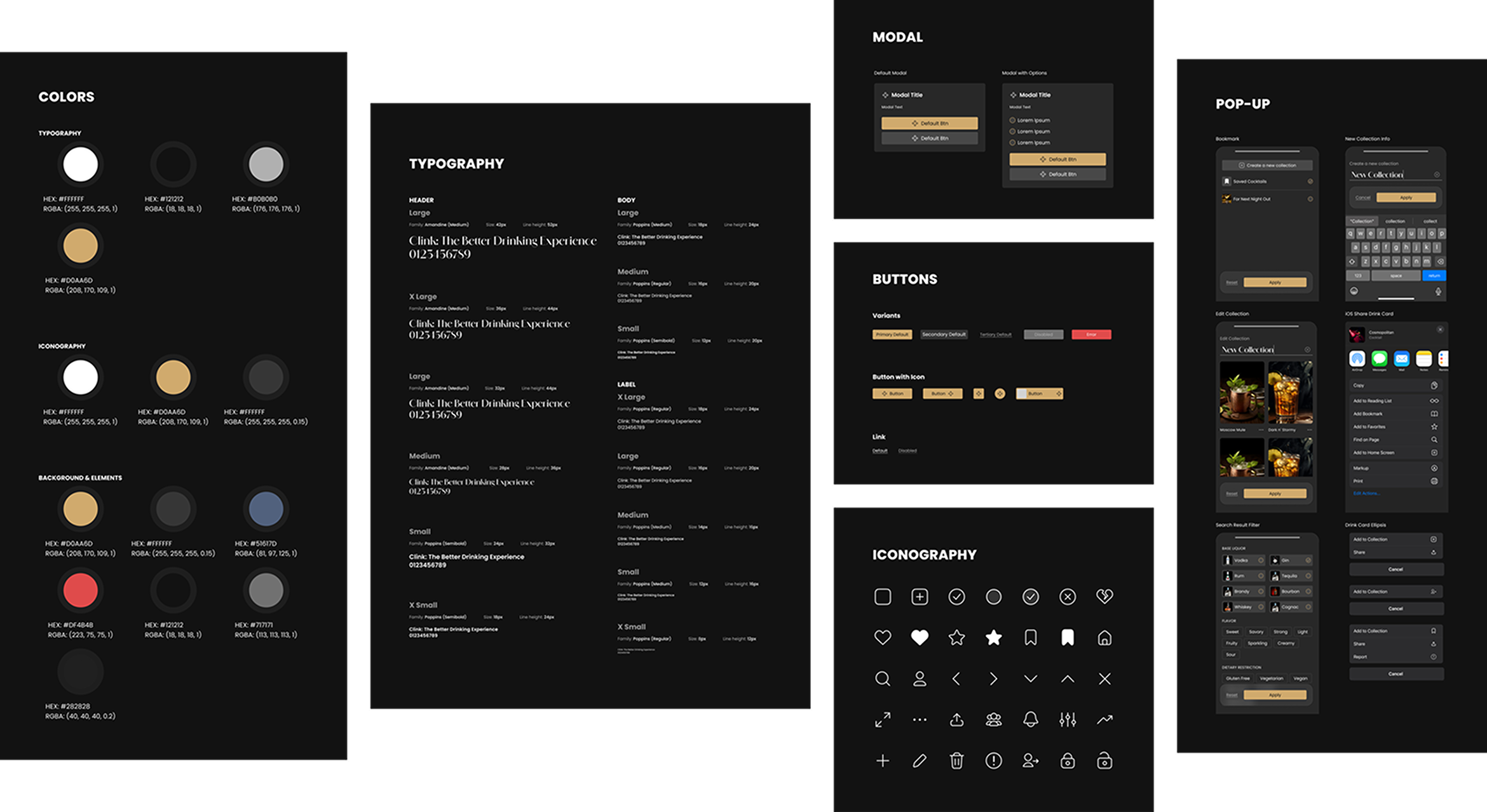
Given the extensive amount of screens and overlays, we deemed that it was crucial to establish a design system early on. Utilizing Figma’s components and variables, we built a modular system from atomic elements. This approach ensured design consistency, streamlined iterations, and significantly reduced the time required for both adjusting small details and changing the overall layout.
Prototype
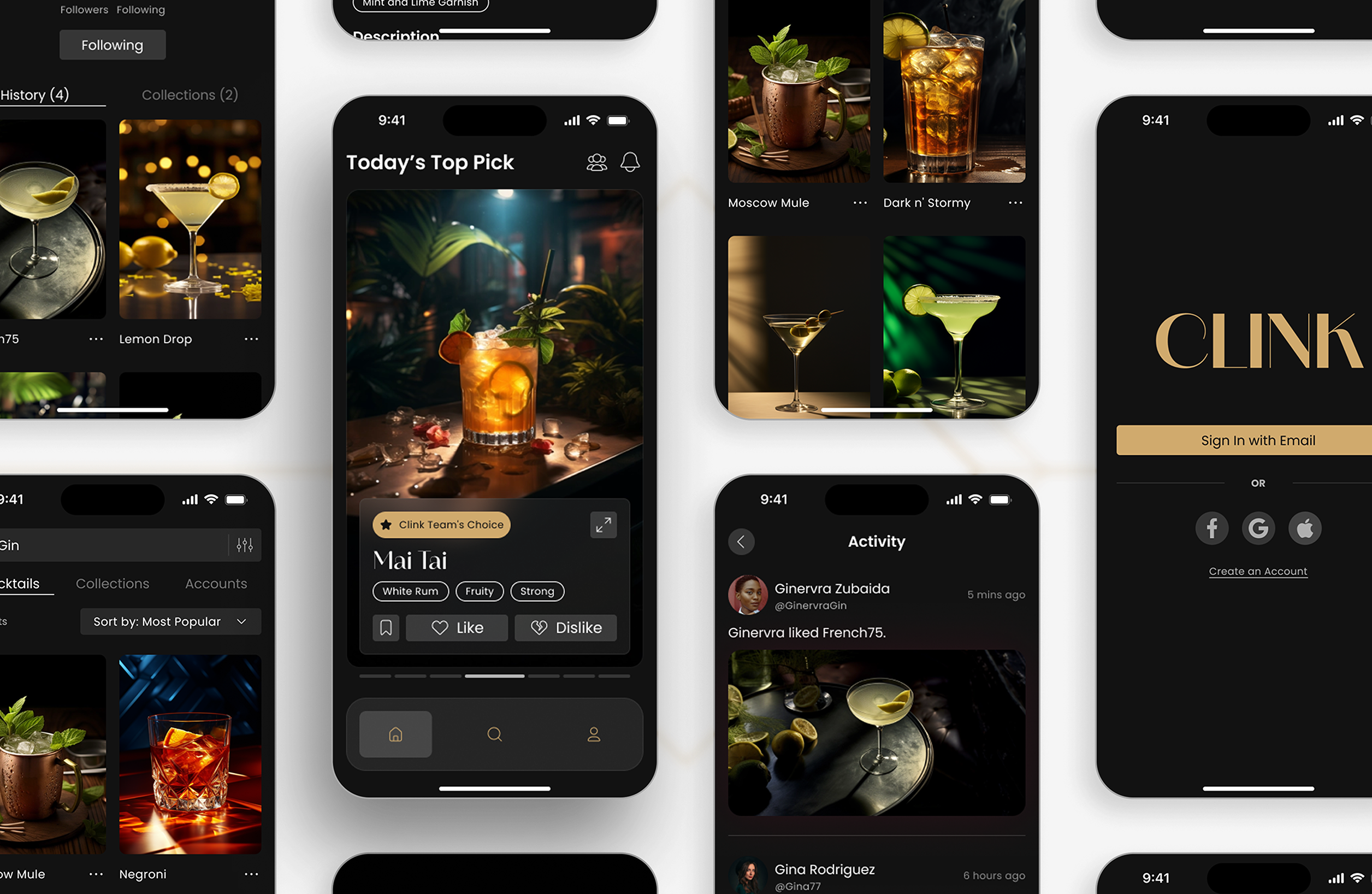
After three major design iterations, we developed a high-fidelity prototype showcasing Clink’s full functionality. At each stage—low-fidelity, mid-fidelity, and high-fidelity, we conducted multiple rounds of usability testing, both in person and via Zoom. By synthesizing results and refining the design, we continuously enhanced the user experience through an iterative, user-centric approach.
Solution
Our final interactive prototype was the culmination of extensive research and iterative design. Built from the ground up using our design system, it brought our vision to life—resulting in Clink, a seamless and user-centered app.
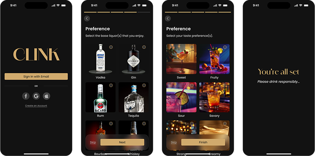
Onboarding
Users start onboarding by selecting dietary restrictions, liquor preferences, and taste profiles, using familiar terms for accessibility. This step enables personalized recommendations from the start. For those without preferences, they can skip it, the algorithm will refine suggestions based on their interactions over time.
Home
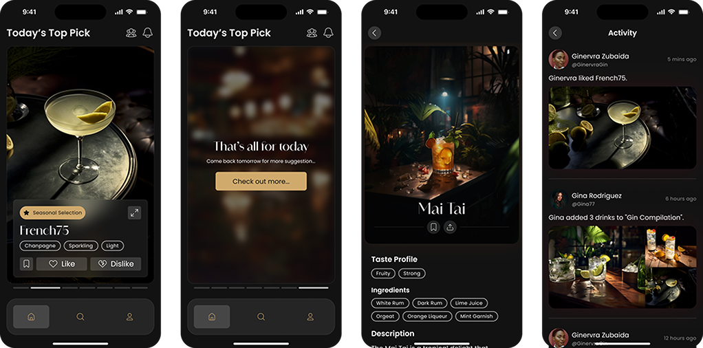
Users receive six daily drink suggestions based on their interactions, favoring liked flavors while reducing disliked elements. Recommendations also factor in popularity, seasonal trends, and similar user preferences, balancing exploration and familiarity. Users can save drinks and share recommendations with others.
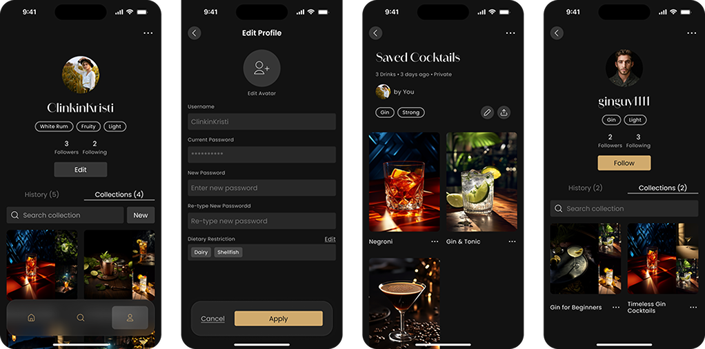
Profile
The profile centers on three personalized tags which are generated based on a user’s liked drink activity. It also features a History tab, where liked drink cards are easily revisited, and a Collections tab for creating and managing created and saved drink collections.
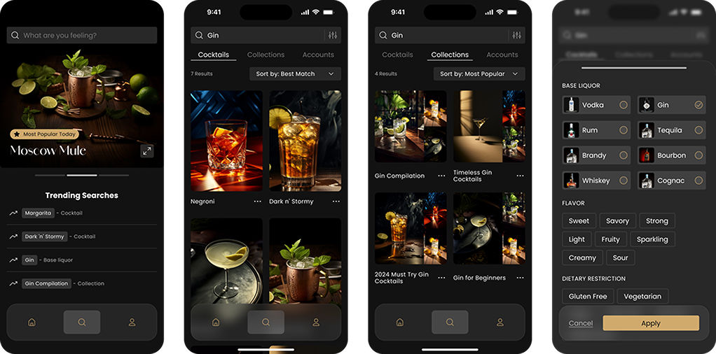
Search
Users can manually search for cocktails with autocomplete and filtering, allowing for effortless exploration of new drinks and collections.
Impact
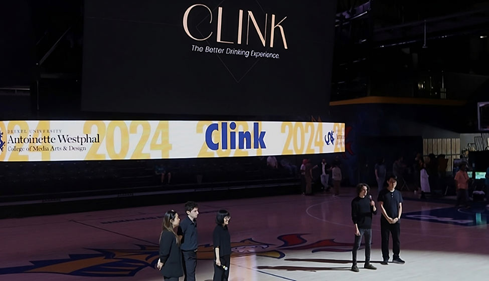
We showcased Clink at Westphal’s Digital Media Senior Showcase & Expo, engaging with
real-world potential users. Over 100 guests visited our
booth, with more than 50 tested our live prototype and
expressing interest in downloading the app. Additionally,
over 50% of visitors
signed up for our newsletter, eager to follow Clink’s development and future launch.
At the same time, we received enthusiastic feedback from business professionals, sparking interest
in bringing Clink to market.
Learning Outcomes
Early Research
Research may be tedious and time-consuming, but it is essential. Our initial research required significant effort but laid a solid foundation for everything that followed. It validated and disproved assumptions, uncovered user pain points and needs, and ensured our designs had real-world impact—preventing us from falling into the trap of designing based on assumptions rather than user realities.
Burnout
Designer burnout is real. Over this nine-month project, we spent countless hours in meetings, discussions, workshops, and personal work. By the halfway point, burnout became evident—not just for me, but for my teammates as well. Recognizing the need for change, we made key adjustments that significantly improved our workflow and well-being:
Changing the Environment – Thanks to the flexibility of UI/UX design, we moved our workspace around campus, using just our laptops and a big screen. This helped refresh our minds and boosted creativity.
Optimize Now, Save Later – Investing time in workflow optimization early on prevented inefficiencies, ultimately saving both time and mental energy.
Role Switching – Rotating roles reduced monotony, provided fresh perspectives, and improved collaboration by fostering a deeper understanding of different responsibilities.
